
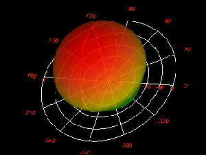
AVS Sponsors the BSO and the Great American Picnic
AVS INVITES FANS TO PARTICIPATE IN THE GREAT AMERICAN PICNIC SWEEPSTAKES! Between now and July 6,... read more
AVS INVITES FANS TO PARTICIPATE IN THE GREAT AMERICAN PICNIC SWEEPSTAKES! Between now and July 6,... read more
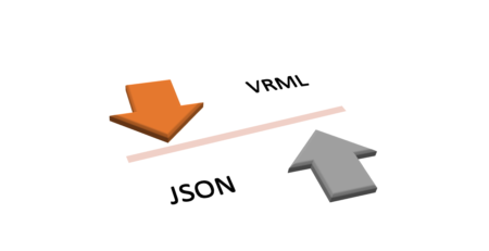
Description: The following converter takes output from AVS/Express as a .WRL file containing VRML. The converter... read more
A collection of new web components created by AVS called AVS/Go allow you to quickly... read more
The purpose of the visualizing and editing software is to provide a tool that can... read more

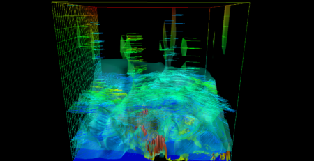
Warsaw University’s Interdisciplinary Centre for Mathematical and Computational Modeling (ICM) has created a sophisticated computational... read more

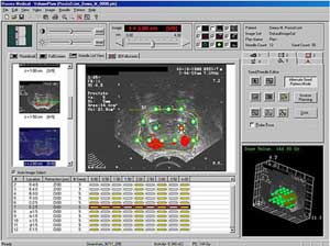
A new endovascular surgery planning tool has been created by the Manchester Visualization Centre (MVC)... read more
AVS/Express is being used to power a suite of sophisticated 3D solutions developed to facilitate... read more
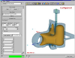
Momentum is a software tool from Agilent that helps predict the performance of high-frequency circuit... read more
“We can now focus on real visualization problems rather than on rendering, data management, interaction,... read more
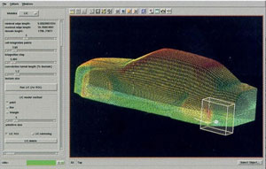
Caterpillar Inc., the world’s leading manufacturer of construction and mining equipment, diesel and natural gas... read more
Whether visualizing fossil bones to understand the relationship between bone structure and the functional characteristics... read more
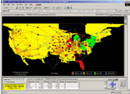
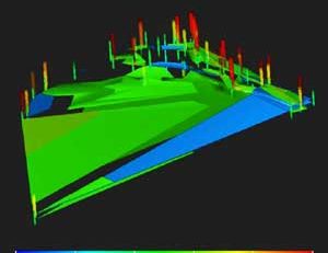
Under the pressures of deregulation, utilities and network operators have limited financial and human resources... read more